

Are your small bedroom walls starting to feel like they’re closing in on you every night? You rearrange the furniture, add “unique” decor pieces, and declutter every corner, yet the room still feels cramped and chaotic. In most cases, the problem isn’t the size of the bedroom; it’s the color palette shaping the entire atmosphere.
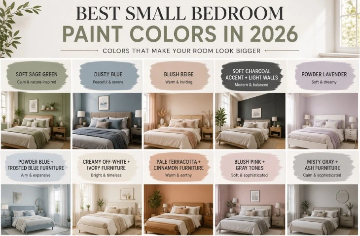
The best small bedroom colors in 2026 are soft sage green, dusty blue, blush beige, misty gray, creamy off-white, powder lavender, and other light-reflective shades that make compact spaces feel brighter, calmer, and visually larger.
Understanding the psychology of color helps create a bedroom that feels open, cohesive, and relaxing instead of visually heavy. Natural lighting, furniture tones, wall finishes, and color undertones all influence how spacious a room appears. This guide breaks down the best small-bedroom color ideas to help you create a more breathable, inviting space without expensive renovations.
The Effect Of Colors In Small Bedrooms
Color is not decoration, it’s spatial psychology. Small rooms lack that “visual breathability,” with every bedroom nook manifesting a heavy and distinct emotion. It lacks a cohesive palette, resulting in the eye stopping at every wall, emphasizing the tight boundaries.
Light paint colors for small rooms reflect light, while dark hues absorb it and blur the boundaries. Particularly when the ceiling is low or the windows are limited, soft chroma palettes are ideal for small designs.
In choosing a suitable chroma scheme, natural light is also quite important. A bright window transforms a chilly gray into a brilliant silver; the lack of light turns a brilliant yellow drab and muddy. These are the very reasons why your little bedroom needs a well-researched palette, not merely Pinterest picture-inspired designs.
What Are the Best Colors for Small Bedrooms in 2026?
Here’s a quick breakdown if you just want the right color without reading everything:
| Color Idea | Best For | Effect In Small Bedrooms | Recommended Pairing | Mood Created |
|---|---|---|---|---|
| Soft Sage Green | Calm, nature-inspired bedrooms | Makes tight spaces feel airy and organic | Walnut furniture + warm fabrics | Relaxing |
| Dusty Blue | Better sleep and peaceful interiors | Adds visual depth without heaviness | Gray upholstery + matte black accents | Serene |
| Blush Beige | Cozy and modern aesthetics | Softens harsh room edges | Light oak + brushed brass | Warm |
| Soft Charcoal Accent + Light Walls | Modern layered interiors | Creates depth while maintaining openness | Japandi furniture + ivory textiles | Balanced |
| Powder Lavender | Feminine and dreamy bedrooms | Adds softness and gentle contrast | Ivory headboards + cotton fabrics | Tranquil |
| Powder Blue + Frosted Blue Furniture | Airy monochromatic designs | Expands visual space and openness | Frosted blue furniture + sheer curtains | Calm |
| Creamy Off-White + Ivory Furniture | Minimal luxury interiors | Maximizes brightness and spaciousness | Matte ivory furniture + linen textures | Clean |
| Pale Terracotta + Cinnamon Furniture | Earthy and cozy spaces | Creates warmth without feeling cramped | Walnut or oak furniture | Comforting |
| Blush Pink + Gray Tones | Soft contemporary bedrooms | Balances warmth with sophistication | Wooden furniture + muted gray accents | Romantic |
| Misty Gray + Ash Furniture | Modern minimalist bedrooms | Reflects light evenly across the room | Ash wood + brushed nickel details | Sophisticated |
1. Soft Sage Green
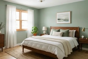
Sage green is a soft, earthy color that has an organic look, while simultaneously extending the calmness of nature without dominating the visual space. This is an ideal choice for creating a calm and tranquil atmosphere, and perfect for small bedroom color ideas for couples.
This hue, which has the effect of enlarging the visual dimensions of a room, also decreases tension and frustration levels, according to psychological research.
Designers recommend an environment of sage green walls with walnut furniture, in addition to using washed cotton fabrics in warm shades of clay or cinnamon, to create a light and peaceful oasis in the space.
Pro Tip: To achieve the best possible peaceful small bedroom environment, experts suggest that the wall finish be either matte or eggshell, providing maximum light-reflecting capability.
2. Dusty Blue
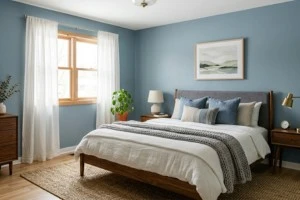
Often referred to as being evocative of a calm sea or dusty sky, this color scheme is a delicate grayish blue that promotes tranquillity in its environment. Unlike saturated dark blues, its soft gray undertone lowers sighted intensity, creating a less claustrophobic environment in a small area.
Interior stylists recommend a sheesham wood bed with muted gray upholstery to give subtle contrast, like the Takashi Upholstered Bed.
Add heather gray waffle-weave blankets for dimensional texture, creating quiet, cozy small bedroom color schemes. Moreover, it helps in reducing insomnia and lowers racing thoughts at 3 am.
Pro Tip: To give the area an optical framework without making it feel heavy, use matte black hardware. This preserves visual openness and prevents the monochromatic impact.
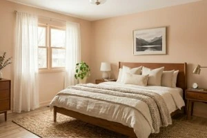
3. Blush Beige
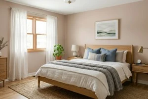
Blush beige is an excellent cozy small bedroom wall color. It’s soft and warm neutral makes the room more inviting. Blush beige also softens the harsh edges, which will give the room a feeling of more space.
The soft pinkish-beige will smooth the room itself and the strong light source, creating a calm and composed feeling in the room, rather than being cramped.
According to color analysts, decorating with soft, warm tones like this will cause a room to feel cozier and more secure. To create this beautiful, cohesive look, use light oak furniture, ivory linen sheets, and brushed brass to give a unique look to the room without being overdone.
Pro Tip: Use warm White light bulbs, as cool white light would make the beige look gray and ruin the room’s aesthetic.
4. Soft Charcoal Accent + Light Walls
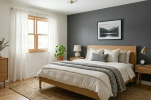
The implementation of a lighter shade on your wall will give the space a larger and more modern small bedroom color ideas. Using dark charcoal lines against your light-colored walls creates a dynamic and visually interesting layering in the architecture of your interior spaces.
While lighter wall tones manifest warmth, a darker accent like charcoal creates a sense of permanence and relaxation. Designers recommend using a Japandi style to create beautiful interiors paired with tertiary hues.
For a fresh appearance, try walnut floating shelf units to coordinate with your bed or use textured ivory textiles (like quilts) and handmade wool area carpets.
Pro Tip: Semi-sheer window coverings are highly recommended to go along with a charcoal accent; they help filter all available light into the room while minimizing harsh reflections.
5. Powder Lavender
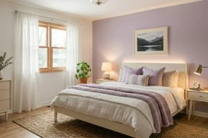
This is the ideal bedroom style for a young girl. Powder lavender resembles a gentle, desaturated violet with a subdued gray hue. Lavender itself is a light, cool-leaning violet that reflects more light.
Together with a much lighter lavender, the ideal subdued contrast for the best depth inside the room, like a lullaby, is produced. Interior designers place a great deal of emphasis on avoiding overfilling your room.
The furniture can’t be too purple, but have complementary calming colors for bedroom, like an ivory boucl upholstered headboard or a canopy bed for a whimsical feel. Combine cotton percale with a really delicate lavender comforter on the bed, and you get a magical area.
Pro Tip: To prevent the lavender from looking flat in a dark room, make sure the room has plenty of natural light or warm-white layered lighting.
Should Furniture Color Match The Walls Or Not?
Your furniture does not need to exactly match your walls, as the space might become flat and uninspired. However, it should coexist with them in a controlled way so the room feels intentional rather than chaotic.
A better approach is coordination instead of matching:
6. Powder Blue + Frosted Blue Furniture
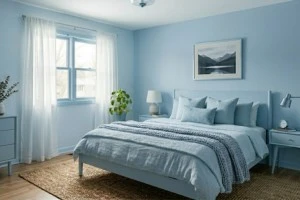
One illustration of tones coexisting as paint colors for small bedrooms is powder blue walls matched with frosted-blue furniture. This combination manifests a sense of visual space and makes the bedroom feel open and airy, creating a relaxed and tranquil feeling.
Psychologists claim that soft blue tones have the ability to reduce heart rates and decrease stimulation, thus promoting a more peaceful, less confining environment.
To enhance and retain a soft and airy feel in this space, designers recommend the use of a matte-frosted blue bed frame, ribbed glass lamps, brushed nickel accents, boucle benches, and sheer white or light grey draperies layered over off-white cotton bedding.
Pro Tip: In order to further enhance the airy, cloud-like quality of this room while avoiding clutter, add a large curved mirror or other softly rounded accessories.
7. Creamy Off-White + Ivory Furniture
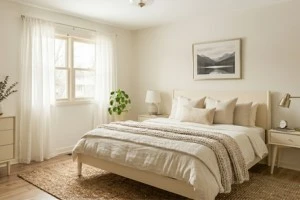
Creamy off-white walls with delicately featured ivory furniture are the perfect combination for a mature and modern design. The white color family always portrays a sanctuary that’s like a hug; soothing to the mind and soul.
The subtle interplay of these light paint colors for small rooms reflects light off themselves to establish a cohesive, perceptible surrounding, thereby evoking a sense of luxury and restoration.
Designer experts suggest keeping your furniture low to the ground in this palette to maximize the negative space above, increasing the illusive height of the ceilings.
Pro Tip: Do not use glossy finished furniture. A matte ivory nightstand and soft-stain walls are the best way to deflect light off them for a subtle, soft ambiance.
8. Pale Terracotta + Cinnamon Furniture
Small rooms can feel cozier with pale terracotta bringing an earthy, sun-ripened color scheme; the addition of cinnamon-stained furniture creates a richly textured and grounded yet open sleep space.
This pairing offers a naturally soothing atmosphere that feels open and less confining while still providing a sense of safety and comfort, even if you create a small nook by the window.
Interior designers frequently recommend pairing cinnamon-stained walnut or oak furniture with boucle accent chairs, alabaster ceramic accents, and wool throws in almond or sand for additional warmth and texture.
Pro Tip: Interior stylists suggest using round-shaped furniture in your compact bedroom, like arched headboards and rounded side tables, for flow to create a silky-smooth and spacious energy in compact bedrooms.
9. Blush Pink + Gray Tones
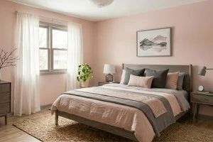
Others may see blush pink as childlike, even more so as feminine to most. But blink and blush pink combined with grey hues will produce the ideal color for a room influenced by a Japanese sakura tree.
Particularly when combined with curved accent seats and mellow, beautiful reading nooks, this combination works well for cozy small-bedroom ideas.
But if you’re feeling really creative, a Chinese/Japanese-inspired room would be perfect for this palette, with tatami mats on the floor and wooden furniture to complement the soft pink. This color scheme looks for a Japanese fan.
Pro Tip: Install hidden warm strip lighting behind headboards or floating shelves to provide depth and make a tiny bedroom appear larger at night.
10. Misty Gray + Ash Furniture
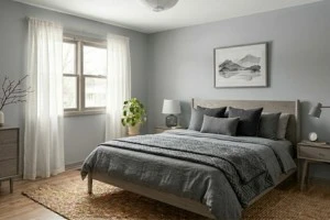
The soft, harmonious interior created by pairing ash furniture with misty gray walls has a subtle, sophisticated feel. While ash wood adds soft, silvery-brown warmth and organic texture, the cool, light-toned gray disperses light around the room.
You could say that they are somewhat calming colors for small rooms. Its subdued tone creates a large environment, while its great light reflectance lessens visual weight and illuminates corners.
To maintain warmth without clutter, interior specialists suggest pairing ash bedframes and streamlined nightstands with off-white or light taupe linen, together with brushed nickel lighting and delicately curved ceramic decoration.
Pro Tip: To soften the straight lines for a more intimate atmosphere, add one curved accent piece, like a round headboard, ribbed pendant, or sculptural ceramic decoration.
Which Colors MUST Be Avoided
1. Totally Black
On Pinterest, you might see quite a few pictures of totally black interiors; they look really expensive and relatively cheap, but in a tight, small room, it’s a dark and moody mess. The color absorbs every last trace of natural light, which makes the small bedroom feel completely closed in.
2. Dark Chocolate Brown
Brown is synonymous with traditional and timeless styles when it comes to bedroom decorating, but dark chocolate colors will act just like black does. Not only is it much darker and deeper than their medium and pale brown counterparts, but they will also eliminate a great deal of ambiance in a bedroom as they have very little reflective light properties.
3. Deep Blue
Psychologically speaking, blue is one of the best colors to use in a bedroom. However, for small bedrooms, deep, dark navy blue hues will absorb almost 90% of the light, which creates a very gloomy and dull-looking bedroom. The shade itself can be very beautiful; however, it will also accentuate the darkness in the bedroom, creating a very dull atmosphere.
4. Pure White
Most interior designers feel that pure white is the best color to choose for small spaces; however, pure white is very different. Pure white can strain and/or fatigue the eyes. The lack of texture, warmth, and character will lend itself to a sterile, hospital-type environment.
Conclusion
Choosing the right calming colors for small bedrooms can completely transform how the space looks and feels. However, small bedroom colors 2026 appear to be trending toward natural-looking hues thanks to the ongoing changes occurring within interiors.
Numerous interior design trends incorporate soothing ambience through their use of modern and elegant palettes. By combining different elements of interior decoration (including furniture, lighting, etc.), through dedicated research, you will not only create a happy, spacious, and relaxing environment, but also increase comfort levels in your space.
FAQs
Yes, dark colours (such as charcoal grey, navy, etc.) make the boundaries of a room difficult to see, which establishes an illusion of infinity and adds Architectural Interest. In saying that, it is best to use them as accent colours against their lighter equivalents.
No. There are many ways to create visual stimulus with your ceiling; contrasting makes the ceiling heighten the perception of height. Valance matching is a very popular way to do so.
Colour Drenching consists of painting the walls, ceiling, trim, and sometimes the furniture in one strong colour. Doing so does create a cohesive look; however, one solid color in the whole room, including in furniture, will lack depth and shadows.
Choose a very pale colour for the walls: add layers of artificial light (ambient – task – accent) and mirrors, and use furniture with light-coloured finishes. The room needs high-reflective elements so that light bounces around for a less congested atmosphere.